Flexbox
Introduction
Flexbox is a one-dimensional layout method to arrange items in rows or columns. Floats and positions features used for creating CSS layouts earlier, using these kinds of features were also limiting and frustrating. It was difficult to vertically center a block of content inside its parent and make all the children of the container take an equal amount of available width and height using floats and positions. Hence flexbox makes a lot of layout tasks in a much easier way.
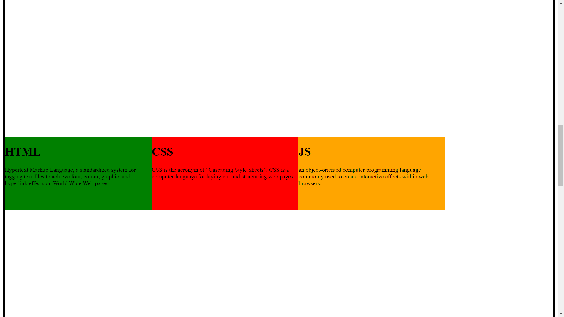
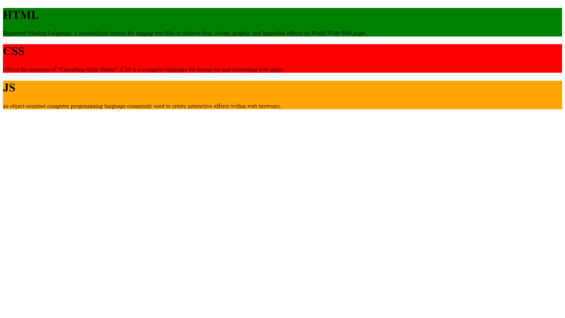
Example without usage of flex:
In the example shown above, the blocks are placed in row format but we want the blocks to allocate in column format.
.html{
            background-color: green;
        }
        .css{
            background-color: red;
        }
        .js{
            background-color: orange;
        }
<div class="container">
        <div class="html">
            <h1>
                HTML
            </h1>
            <p>Hypertext Markup Language, a standardized system for tagging text files to achieve font, colour, graphic, and hyperlink effects on World Wide Web pages.</p>

        </div>
        <div class="css">
            <h1>CSS</h1>
            <p>CSS is the acronym of “Cascading Style Sheets”. CSS is a computer language for laying out and structuring web pages</p>
        </div>
        <div class="js">
            <h1>JS</h1>
            <p>an object-oriented computer programming language commonly used to create interactive effects within web browsers.</p>

        </div>
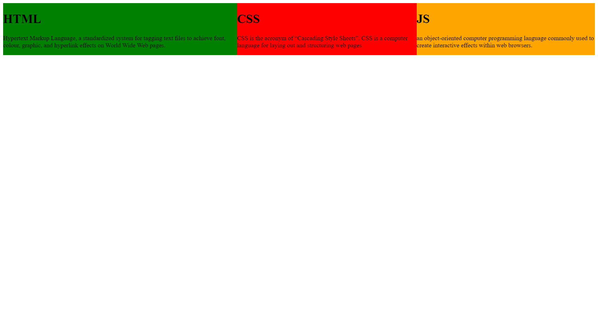
Example with usage of flex:
The blocks to allocate in column format, we use the display: flex property on the parent element. Here display property is used on the container class.
.html{
            background-color: green;
        }
        .css{
            background-color: red;
        }
        .js{
            background-color: orange;
        }
        .container{
            display:flex;
        }
<div class="container">
        <div class="html">
            <h1>
                HTML
            </h1>
            <p>Hypertext Markup Language, a standardized system for tagging text files to achieve font, colour, graphic, and hyperlink effects on World Wide Web pages.</p>

        </div>
        <div class="css">
            <h1>CSS</h1>
            <p>CSS is the acronym of “Cascading Style Sheets”. CSS is a computer language for laying out and structuring web pages</p>
        </div>
        <div class="js">
            <h1>JS</h1>
            <p>an object-oriented computer programming language commonly used to create interactive effects within web browsers.</p>

        </div>

    </div>
Basic terminology
Elements are laid out along two axes.
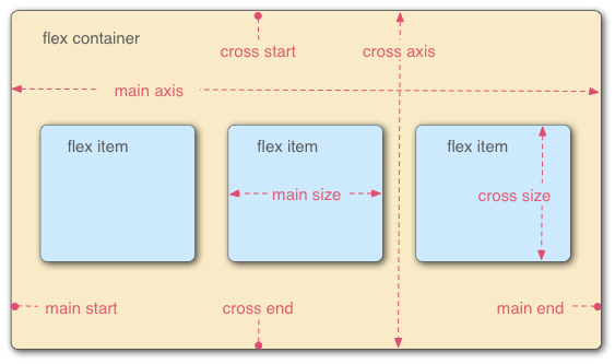
The main axis is the default axes that are running in the direction the flex items are laid out in. The start and end of this axis are called the main start and main end.
The cross axis is the axis running perpendicular to the direction of default axes. The start and end of this axis are called the cross start and cross end.
The parent element that has display: flex property is called the flex container.
The items laid out as flexible boxes inside the flex container are called flex items.
Flex-direction
Flexbox provides flex-direction property to arrange the items in a row or column. Flex-direction has values like row, row-reverse, column, and column-reverse.
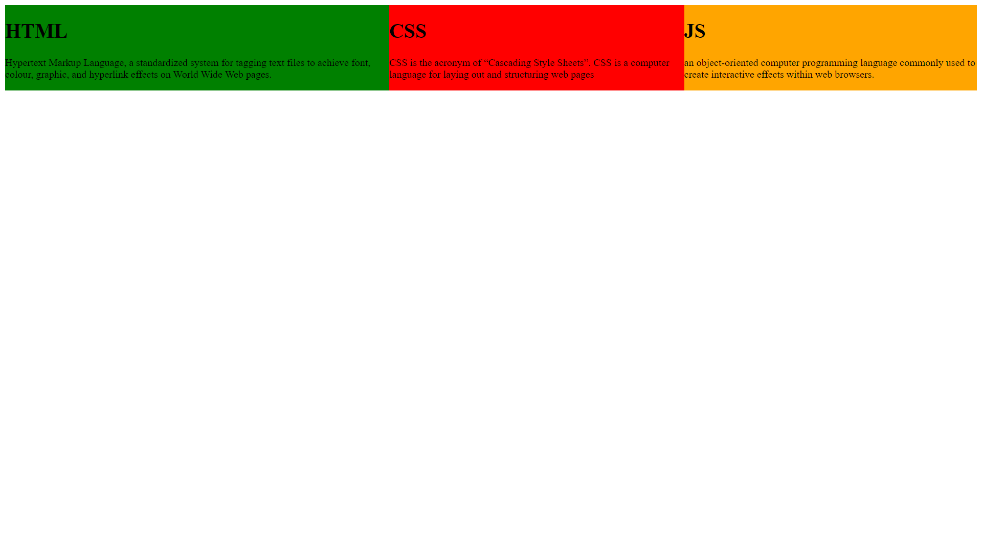
Flex-direction:row
Displays the elements in a row.
.container{
            display:flex;
            flex-direction: row;
        }
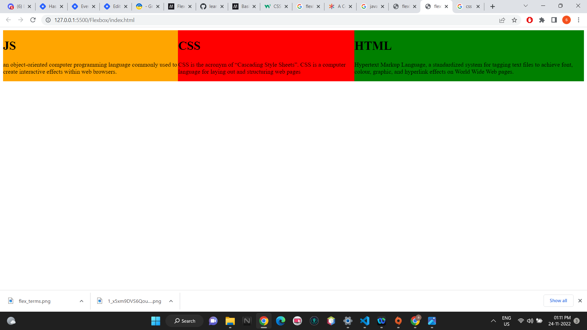
Flex-direction:row-reverse
Reverse the row elements. In the example, HTML and JS blocks are exchanged.
.container{
            display:flex;
            flex-direction: row-reverse;
        }
Flex-direction:column
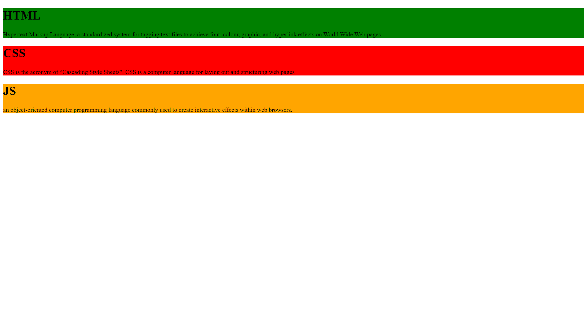
The elements are arranged in a column.
.container{
            display:flex;
            flex-direction: column;
        }
Flex-direction:column-reverse
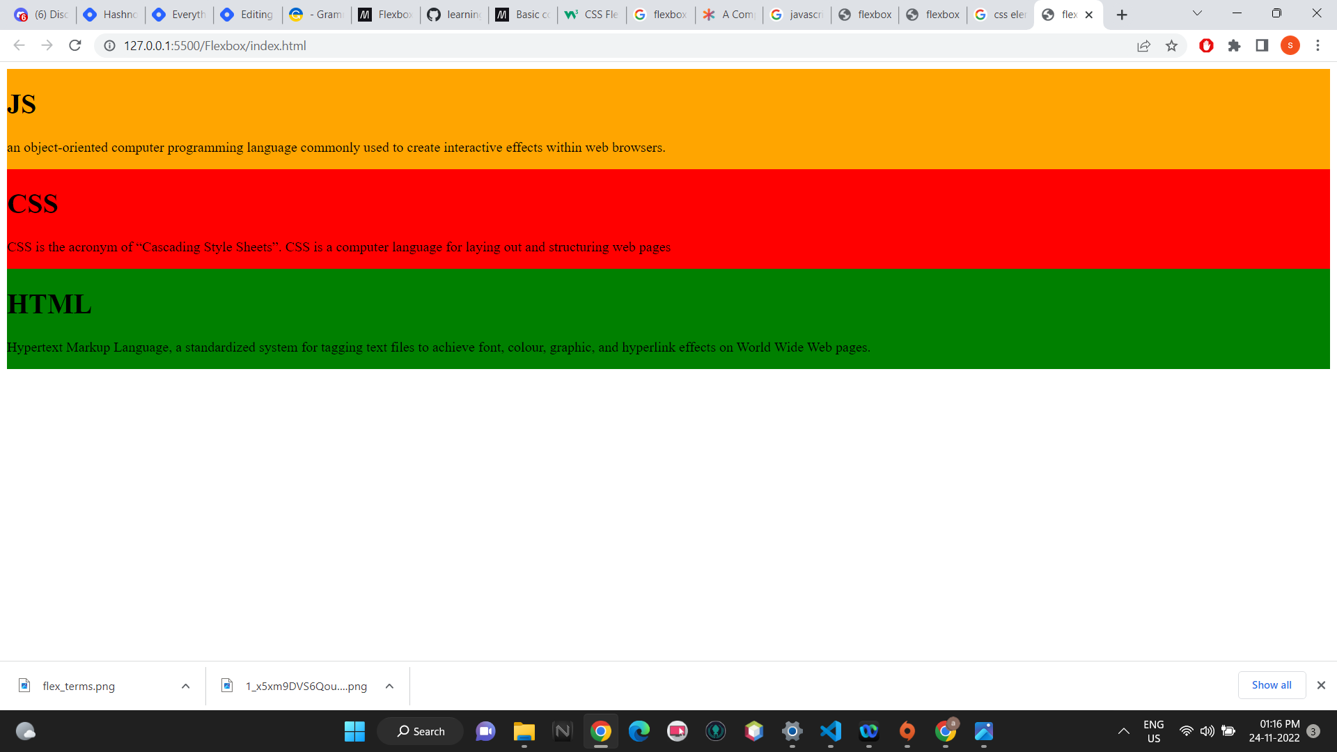
The column elements are reversed.
.container{
            display:flex;
            flex-direction: column-reverse;
        }
flex
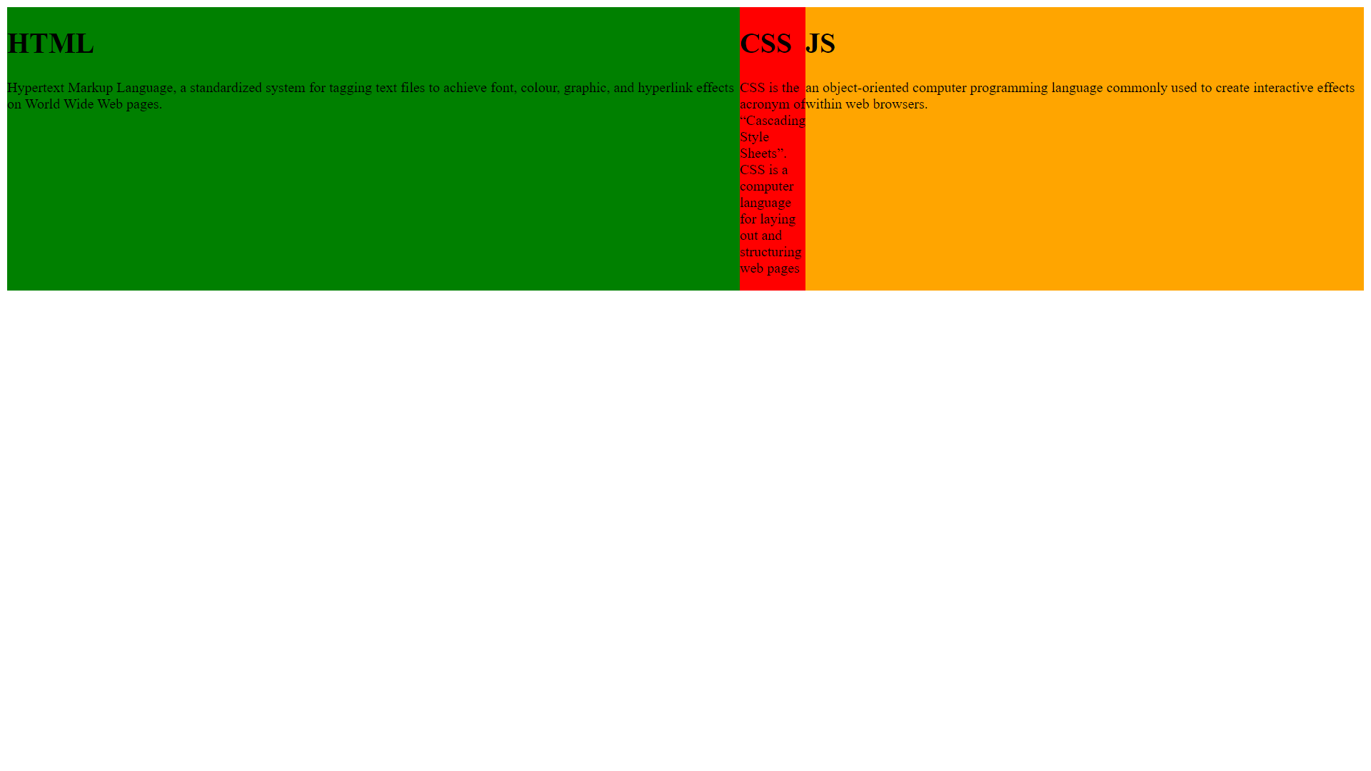
We can control the child elements available space along the main axis by using the flex property.
.css{
            flex:2;
        }
<div class="container">
        <div class="html">
            <h1>
                HTML
            </h1>
            <p>Hypertext Markup Language, a standardized system for tagging text files to achieve font, colour, graphic, and hyperlink effects on World Wide Web pages.</p>

        </div>
        <div class="css">
            <h1>CSS</h1>
            <p>CSS is the acronym of “Cascading Style Sheets”. CSS is a computer language for laying out and structuring web pages</p>
        </div>
        <div class="js">
            <h1>JS</h1>
            <p>an object-oriented computer programming language commonly used to create interactive effects within web browsers.</p>

        </div>

    </div>
gap
The gap is used to give space between the items.
.container{
            display:flex;
            gap:10px;


        }
<div class="container">
        <div class="html">
            <h1>
                HTML
            </h1>
            <p>Hypertext Markup Language, a standardized system for tagging text files to achieve font, colour, graphic, and hyperlink effects on World Wide Web pages.</p>

        </div>
        <div class="css">
            <h1>CSS</h1>
            <p>CSS is the acronym of “Cascading Style Sheets”. CSS is a computer language for laying out and structuring web pages</p>
        </div>
        <div class="js">
            <h1>JS</h1>
            <p>an object-oriented computer programming language commonly used to create interactive effects within web browsers.</p>

        </div>

    </div>
Justify-content
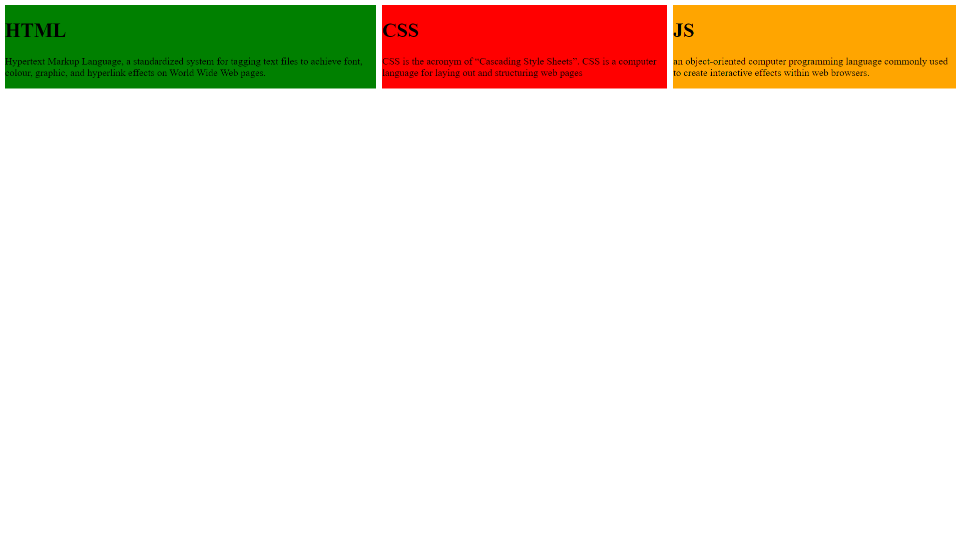
Justify-content property aligns the container's items on the main axis. Flex-start, flex-end, space-between ,space-around, and space-evenly are the few values for the justify-content.
flex-start
Items align from starting of the container.
.container{
            display:flex;
            justify-content: flex-start;
            border:5px solid black;


        }
<div class="container">
        <div class="html">
            <h1>
                HTML
            </h1>
            <p>Hypertext Markup Language, a standardized system for tagging text files to achieve font, colour, graphic, and hyperlink effects on World Wide Web pages.</p>

        </div>
        <div class="css">
            <h1>CSS</h1>
            <p>CSS is the acronym of “Cascading Style Sheets”. CSS is a computer language for laying out and structuring web pages</p>
        </div>
        <div class="js">
            <h1>JS</h1>
            <p>an object-oriented computer programming language commonly used to create interactive effects within web browsers.</p>

        </div>

    </div>
flex-end
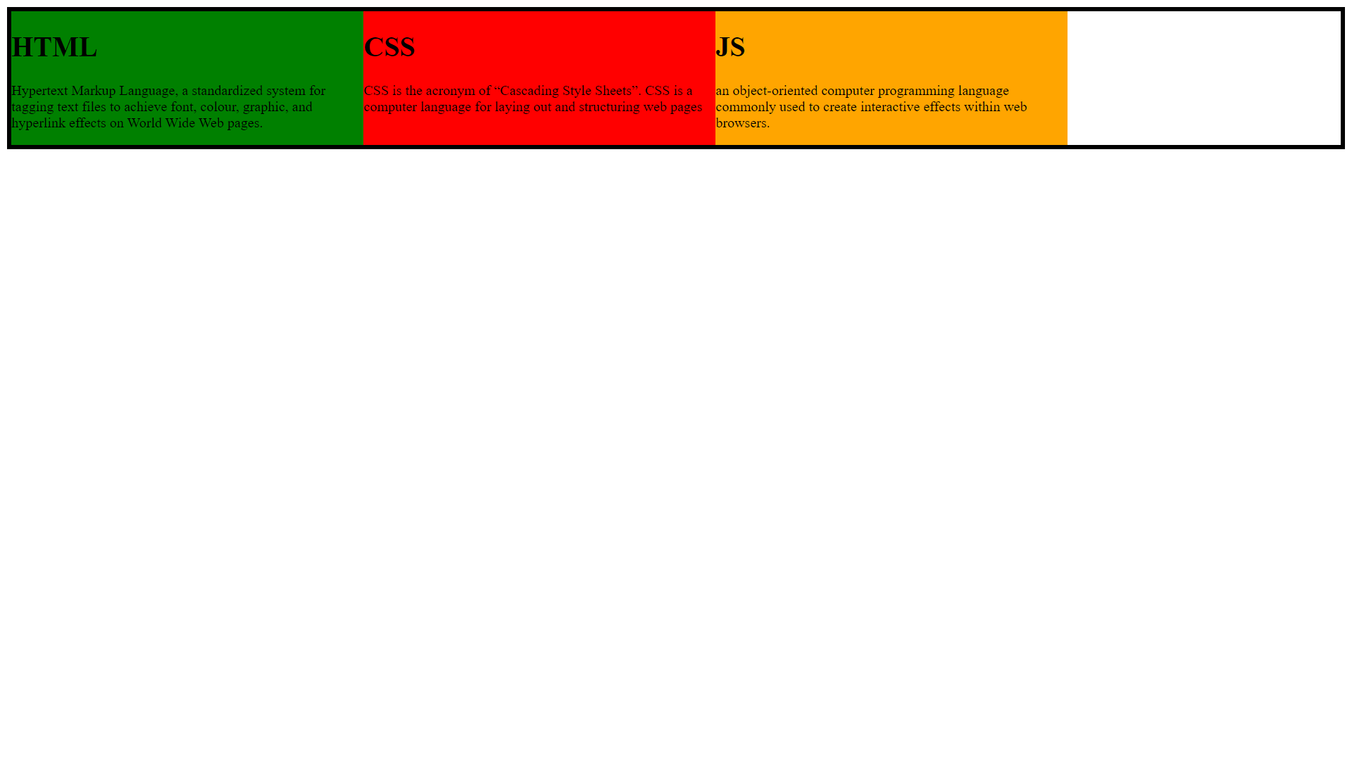
Items align from ending of the container.
.container{
            display:flex;
            justify-content: flex-end;
            border:5px solid black;


        }
<div class="container">
        <div class="html">
            <h1>
                HTML
            </h1>
            <p>Hypertext Markup Language, a standardized system for tagging text files to achieve font, colour, graphic, and hyperlink effects on World Wide Web pages.</p>

        </div>
        <div class="css">
            <h1>CSS</h1>
            <p>CSS is the acronym of “Cascading Style Sheets”. CSS is a computer language for laying out and structuring web pages</p>
        </div>
        <div class="js">
            <h1>JS</h1>
            <p>an object-oriented computer programming language commonly used to create interactive effects within web browsers.</p>

        </div>

    </div>
space-between
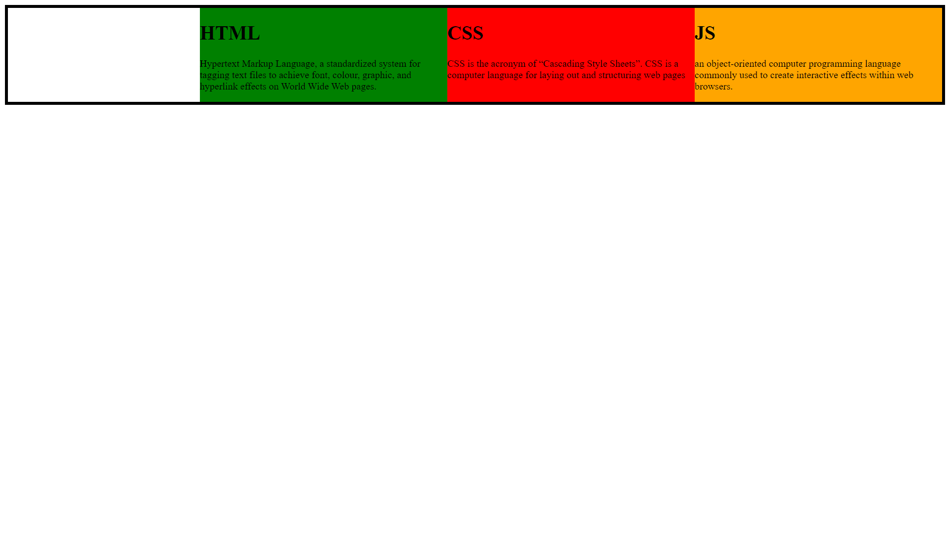
Items will have space between.
.container{
            display:flex;
            justify-content: space-between;
            border:5px solid black;


        }
<div class="container">
        <div class="html">
            <h1>
                HTML
            </h1>
            <p>Hypertext Markup Language, a standardized system for tagging text files to achieve font, colour, graphic, and hyperlink effects on World Wide Web pages.</p>

        </div>
        <div class="css">
            <h1>CSS</h1>
            <p>CSS is the acronym of “Cascading Style Sheets”. CSS is a computer language for laying out and structuring web pages</p>
        </div>
        <div class="js">
            <h1>JS</h1>
            <p>an object-oriented computer programming language commonly used to create interactive effects within web browsers.</p>

        </div>

    </div>
space-around
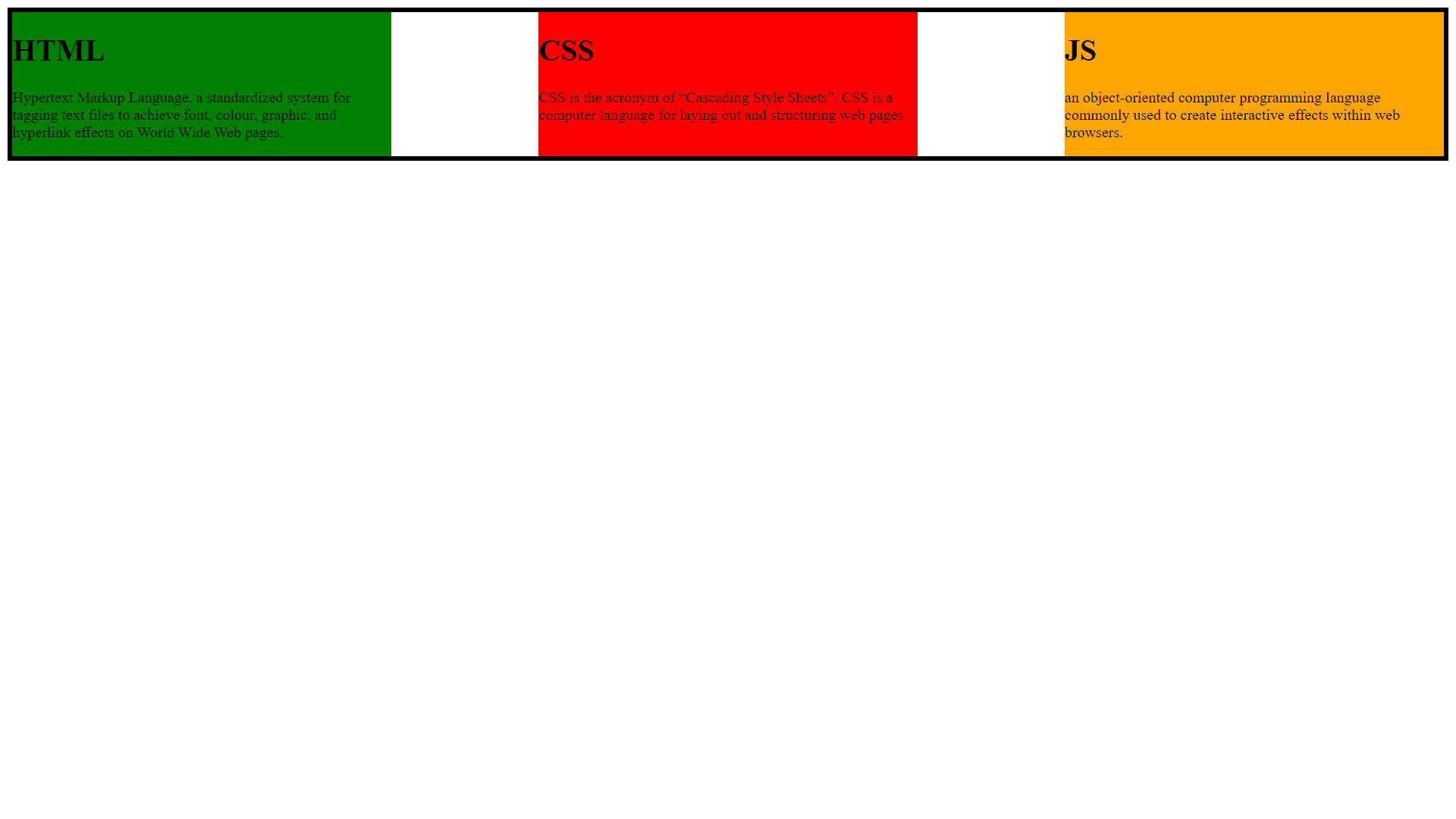
Items will have space before, between, and after them.
 .container{
            display:flex;
            justify-content: space-around;
            border:5px solid black;


        }
<div class="container">
        <div class="html">
            <h1>
                HTML
            </h1>
            <p>Hypertext Markup Language, a standardized system for tagging text files to achieve font, colour, graphic, and hyperlink effects on World Wide Web pages.</p>

        </div>
        <div class="css">
            <h1>CSS</h1>
            <p>CSS is the acronym of “Cascading Style Sheets”. CSS is a computer language for laying out and structuring web pages</p>
        </div>
        <div class="js">
            <h1>JS</h1>
            <p>an object-oriented computer programming language commonly used to create interactive effects within web browsers.</p>

        </div>

    </div>
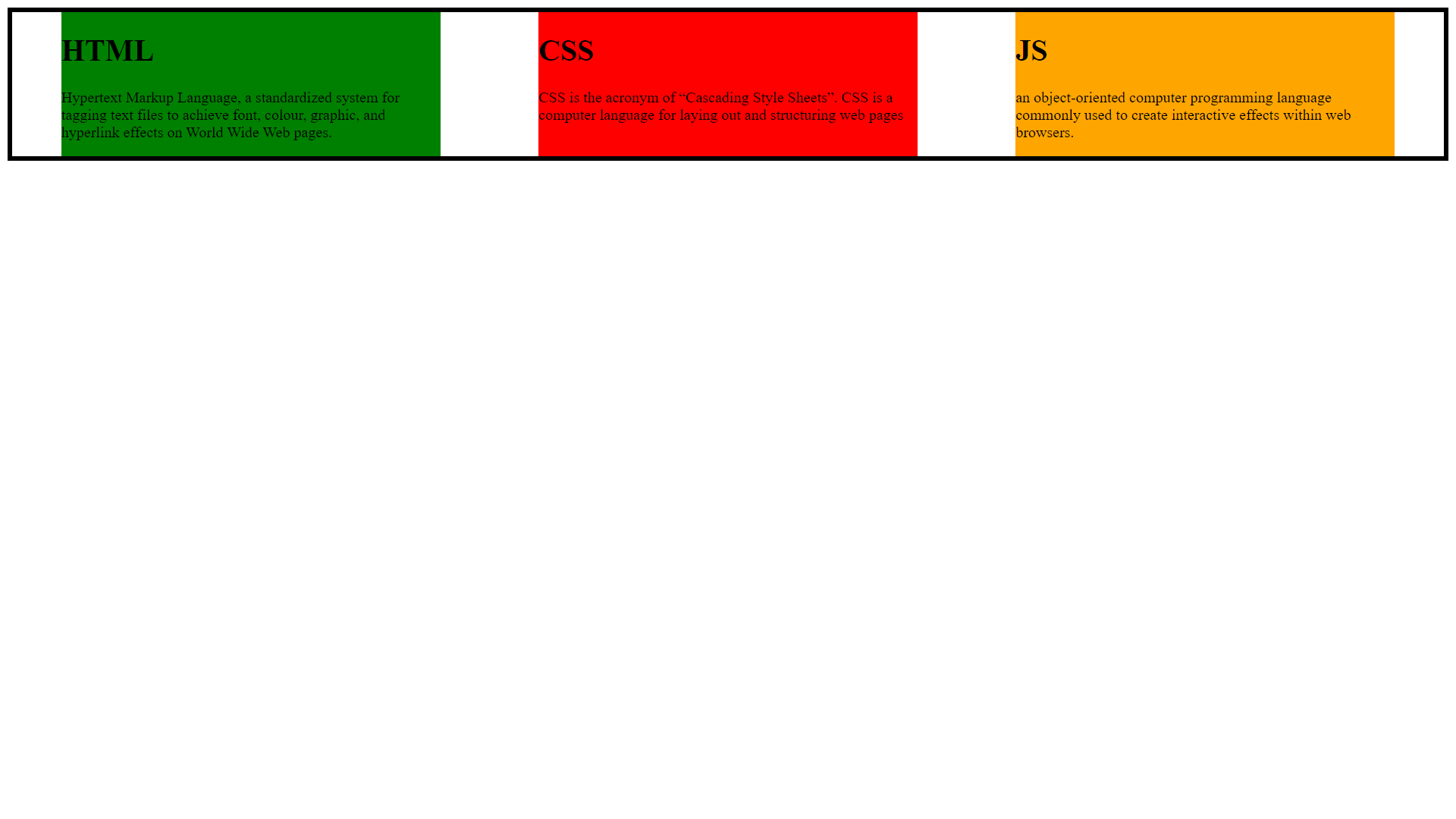
space-evenly
Items will have equal space around them
 .container{
            display:flex;
            justify-content: space-evenly;
            border:5px solid black;


        }
<div class="container">
        <div class="html">
            <h1>
                HTML
            </h1>
            <p>Hypertext Markup Language, a standardized system for tagging text files to achieve font, colour, graphic, and hyperlink effects on World Wide Web pages.</p>

        </div>
        <div class="css">
            <h1>CSS</h1>
            <p>CSS is the acronym of “Cascading Style Sheets”. CSS is a computer language for laying out and structuring web pages</p>
        </div>
        <div class="js">
            <h1>JS</h1>
            <p>an object-oriented computer programming language commonly used to create interactive effects within web browsers.</p>

        </div>

    </div>
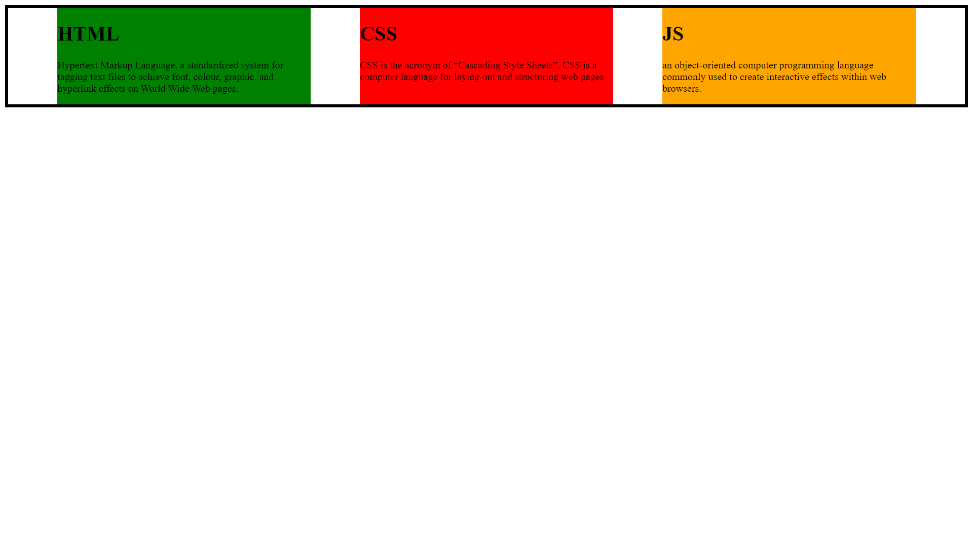
center
Items are positioned in the center of the container.
.container{
            display:flex;
            justify-content: center;
            border:5px solid black;


        }
<div class="container">
        <div class="html">
            <h1>
                HTML
            </h1>
            <p>Hypertext Markup Language, a standardized system for tagging text files to achieve font, colour, graphic, and hyperlink effects on World Wide Web pages.</p>

        </div>
        <div class="css">
            <h1>CSS</h1>
            <p>CSS is the acronym of “Cascading Style Sheets”. CSS is a computer language for laying out and structuring web pages</p>
        </div>
        <div class="js">
            <h1>JS</h1>
            <p>an object-oriented computer programming language commonly used to create interactive effects within web browsers.</p>

        </div>

    </div>
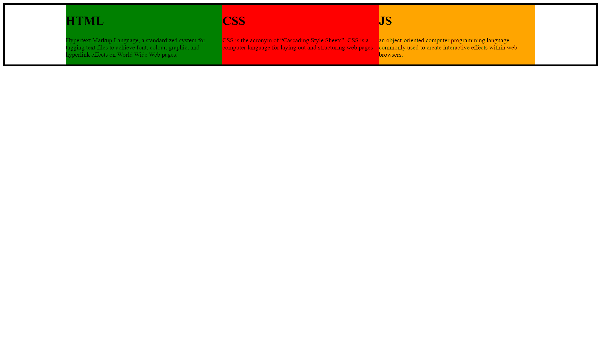
align-items
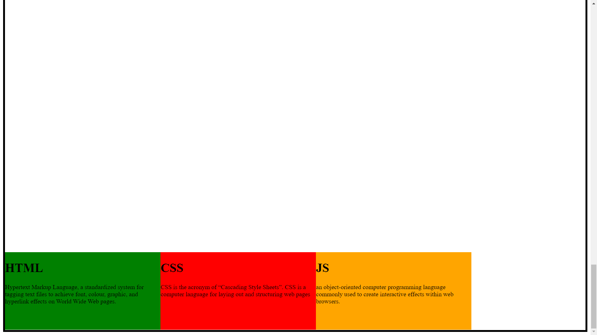
align-item property aligns the container's items on the cross axis. Center, flex-start and flex-end are the few values for the align-items.
flex-start
.container{
            display:flex;

            border:5px solid black;
            height:500vh;
            align-items: flex-start;


        }
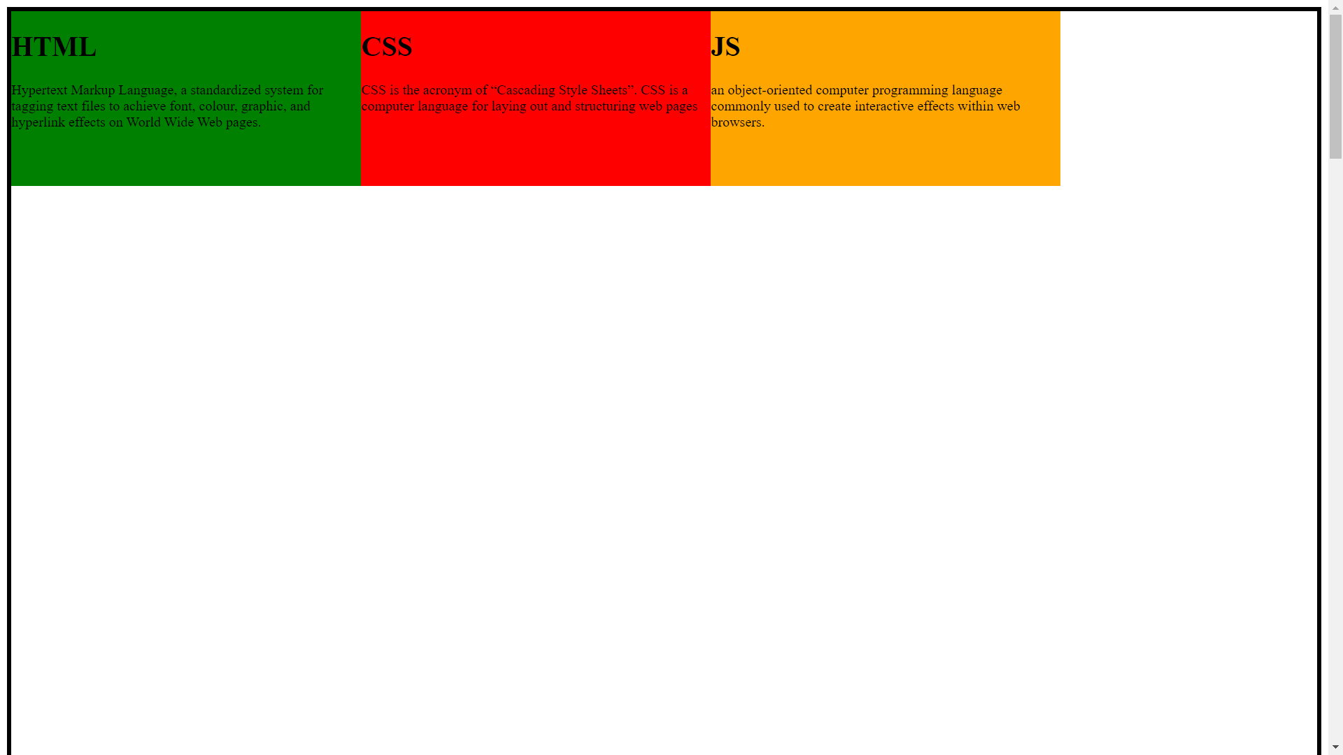
flex-end
.container{
            display:flex;

            border:5px solid black;
            height:500vh;
            align-items: flex-end;


        }
center
.container{
            display:flex;

            border:5px solid black;
            height:500vh;
            align-items: Center;


        }