Media Query in CSS

Media Query
Media query makes responsive web pages. Responsive web design makes web pages look good on different screen sizes. Web pages are viewed on three different devices. That is mobile, tablet, and laptop. We can change the CSS property for all three devices using media query. We can add a breakpoint, and from that point, certain parts of the webpage will behave differently on each side of the breakpoint. Mobile First means designing for mobile before designing for any other device.
Code for media query
body{
            background-color: pink;
            height:100vh;
        }
        .container{
            display:flex;
            gap:10px;
        }
        .circle{
            height: 70px;
            width:70px;
            border-radius: 50px;
            background-color: black;

        }
        @media(max-width:600px) {
            body{
                background-color: green;
            }
            .container{
                display:flex;
                flex-direction: column;
            }

        }
<div class="container">
        <div class="circle"></div>
        <div class="circle"></div>
        <div class="circle"></div>
        <div class="circle"></div>
    </div>
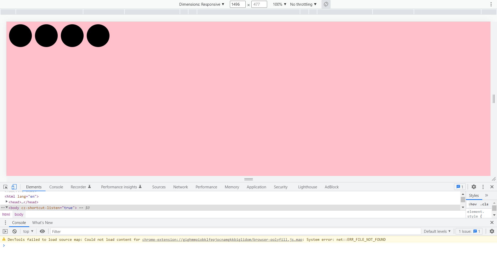 Screen width above 600px.
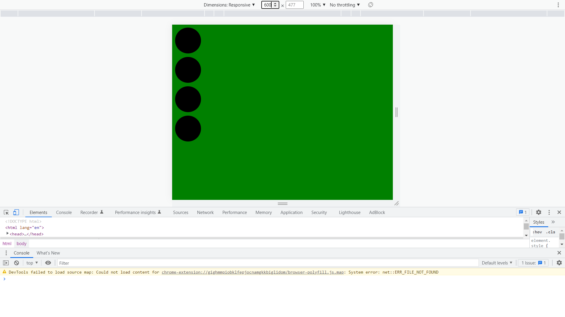
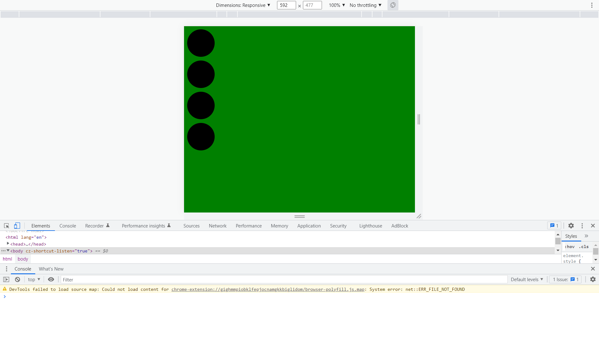 screen width below 600px.
We can define many media queries.
body{
            background-color: pink;
            height:100vh;
        }
        .container{
            display:flex;
            gap:10px;
        }
        .circle{
            height: 70px;
            width:70px;
            border-radius: 50px;
            background-color: black;

        }
        @media(max-width:600px) {
            body{
                background-color: green;
            }
            .container{
                display:flex;
                flex-direction: column;
            }

        }
        @media(min-width:601px ) and (max-width:900px) {
            body{
                background-color: red;
            }
            .container{
                display:flex;
                flex-direction: row-reverse;
            }

        }
<div class="container">
        <div class="circle"></div>
        <div class="circle"></div>
        <div class="circle"></div>
        <div class="circle"></div>
    </div>
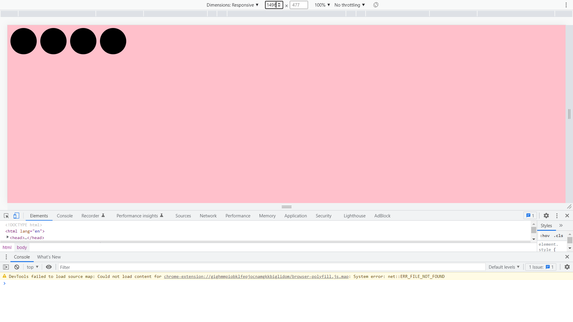
When the screen size is above 900px
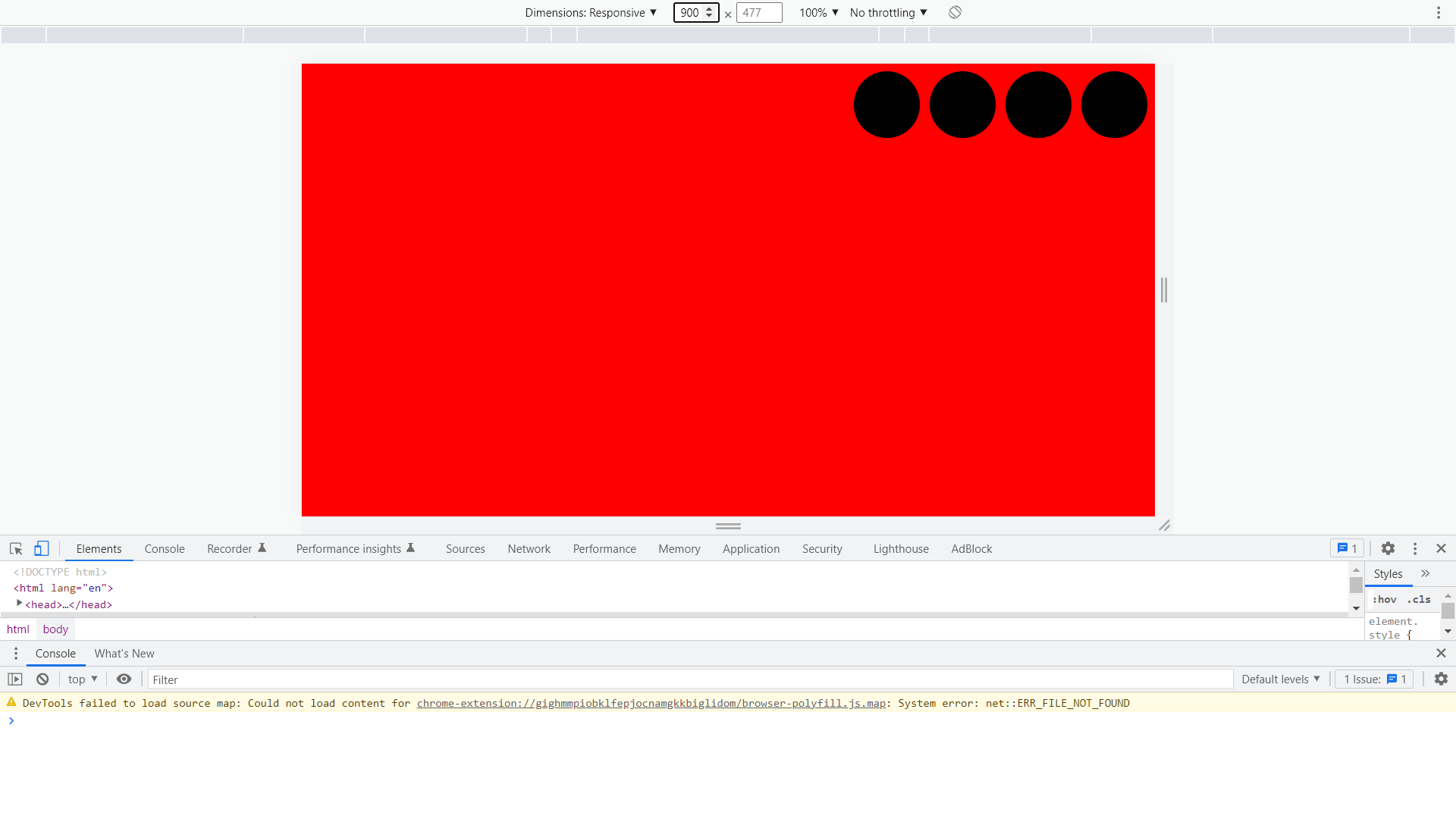
When the screen size is below 900px
When the screen size is below 600px